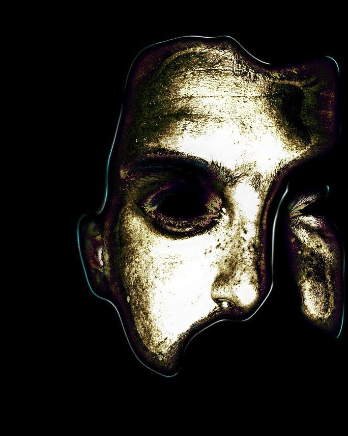
- cross-posted to:
- firefox@lemmy.ml
I have to admit, I really don’t like this. The old logo looked pretty neat and the “://” part was a stroke of genius.
I mean, if the intention is to reflect the utterly bad decisions Mozilla has made, this new logo would be spot on
I do like the new logo, but it is a bit sad to see the :// gone.
Coincidentaly :/ is the symbol for “a bit sad”
Fuck you, Mozilla, it’s uglier and tells less about your core product, which is also the only thing you have that makes people tolerate your other stupid decisions.
Also, fuck your “a” in that font. I’d punch that fucking glyph in the face if it spoke to me on the street.
I’m right there with you. Although I might not wait for that glyph to speak 😜
What other problems left to solve? Right, let’s change the logo.
Am I the only one who only sees a pitch black image?
Pretty sure it’s black on transparent. Not the most visible, especially if your client makes the background black.
I switched to light mode to take a look at it and now I can confirm it looks absolutely terrible.
Great sign that organizational resources are being arranged into a pointless circlejerk safely removed from browser & Thunderbird development, or finding opportunities to monetize that aren’t products nobody asked for outside the nonprofit corporate bureacracy
Should’ve used Papyrus
The only REAL Mozilla logo


