

Yeah but once you’ve done it once in R you can just dump your data again, update the theme and boom, done again.
Also 30 minutes? maybe 3.
You’ll get used to it and it will only take a couple of minutes. And I honestly believe nothing comes close to ggplot2 in terms of quality, and I don’t use R for anything else.
How does it compare to matplotlib?
Plots are typical composed, and when writing a paper (I insert them mostly into TeX publications) I do find the quality of the resulting plot is just so much more refined.
Seaborn is indeed closer and was definitely inspired by ggplot2 in some areas, but IMHO, it’s still not 100% there visually. I’m very much a Python user and would love it to be, but when I’m, let’s say, publishing a book, I’d always go back to ggplot2 - when preparing a paper for a lab class, seaborn is probably fine.
It’s a beautiful graph. And the stats are great. But I’m in industry so I use excel
yes but f&£k excel
It me, but excel is the bad option and plotly is the good option.
Plotly has the most pain-in-the-ass syntax compared to ggplot2 IMHO. And that’s from a guy who uses a tonne of plotly.
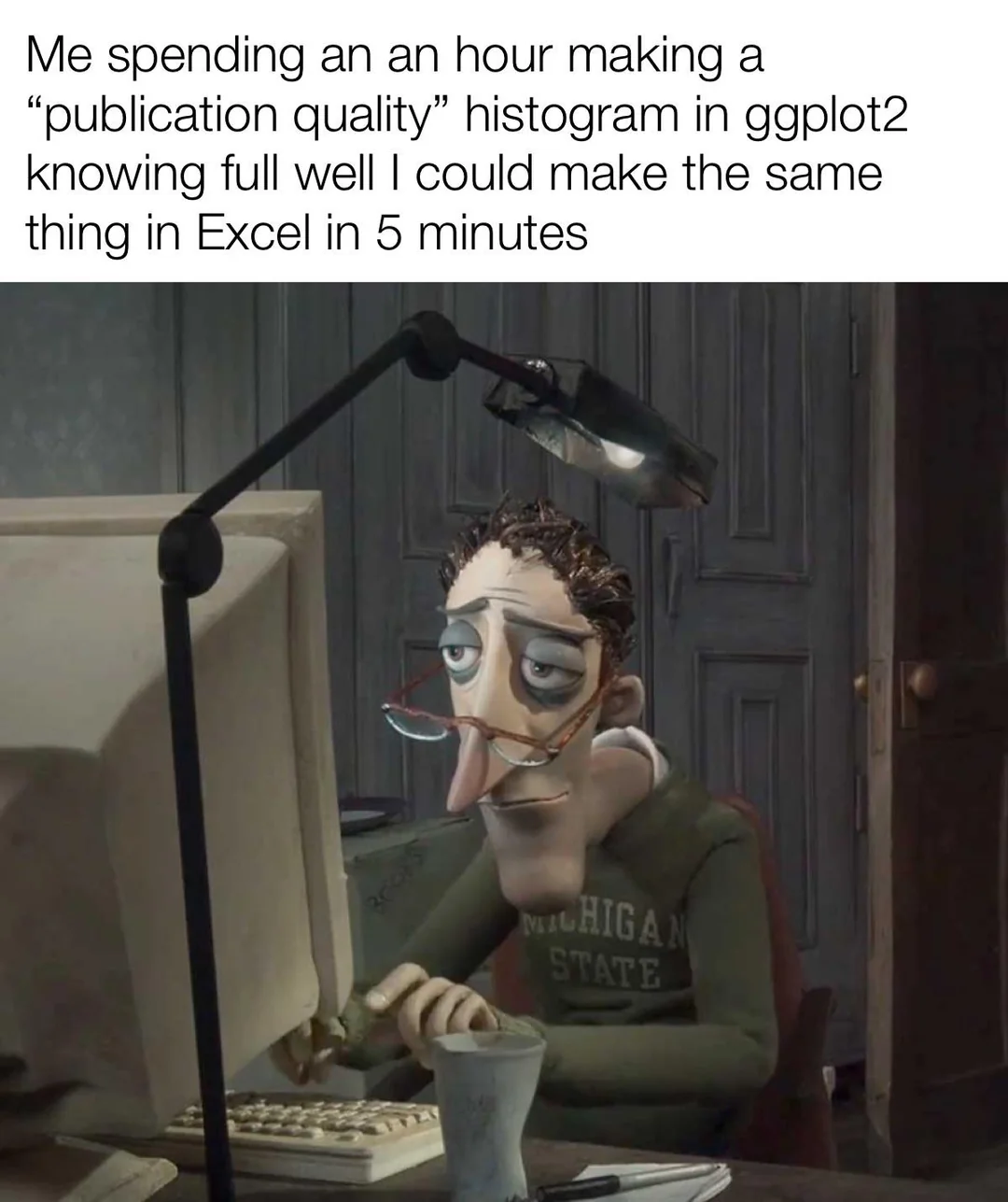
Does anyone know where the image is from? I know I’ve seen the movie or whatever it is but just can’t remember.
Coraline
Thank you! I thought that might be it, just doubted that thought.
Gonna rewatch it, haven’t seen it since it was new.
It’s gotta be a Tim Burton, no?
Yeah, it is! I thought it might be but felt it was something else with a similar style. Big fan of this kind of caricature stop-motion style.
Did anyone read the grammar of graphics paper from Hadley Wickham? I kind of enjoyed it a lot, and got to know what’s the power source really. I’m amazed so many software libraries came to reinvent compossibility in such unergonomic ways… But it’s nice to have options.
I think I might prefer base R over matplotlib though… :p
I’ll just leave this here https://beautiful.makie.org/dev/examples/2d/histogram/hist

